
**Collaborative post**
When designing a logo for anything it is really important to make it eye-catching, we can all be guilty of focusing really hard on the graphics of our designs, be that our Blog logo’s, social media images for our businesses or even flyers for our to hand out for events, but one thing we really need to focus on and experiment with is the fonts we use on these.
Selecting the best free fonts is a crucial, yet often overlooked, activity in design when you’re working with a tight budget. Amateurs tend to invest too little attention when choosing fonts for their projects, whether it is about a website, a presentation, or traditional media items.
The typeface you use has to be aligned with the style that you have already adopted for the project itself, as well as with its purpose. You’ll need to think about what you want to convey to your audience: Formality? Playfulness? Futurism? Nostalgia?
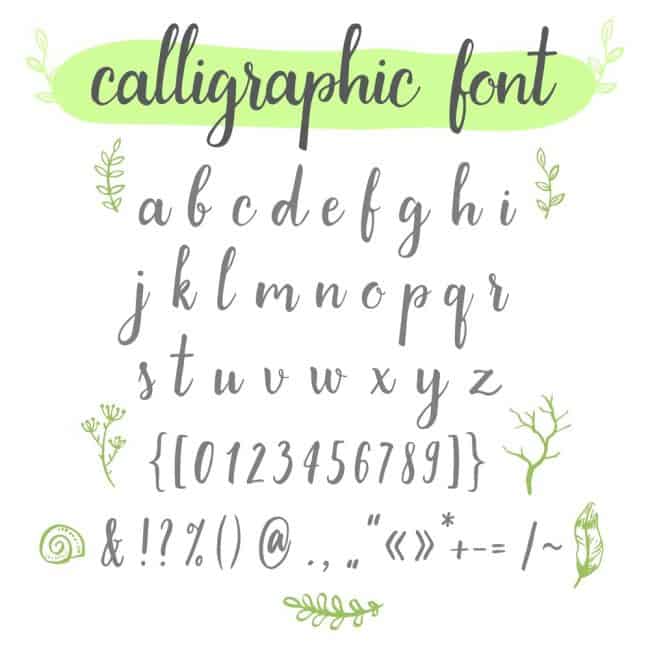
They can be as individual as you are, and there are so many options to choose from BUT just because you fall in love with a font, doesn’t mean it will work for your design – test out a few first, ask options and get votes from friends. After all, you know what the wording should say but not everyone else does, so if the font makes it impossible to read you will be putting off potential customers/readers or clients because they have no idea what you are saying due to the poor font choice making it illegible.
Unreadable fonts, as fabulous as they may look, can be safely eliminated from your shortlist, so you can already reduce your search to those with good communication properties and solid legibility.
The best fonts can be altered according to your needs in terms of both size and letter spacing and there are so many which can be downloaded as an alternative to 1001 Fonts.
There are so many places you can look for fonts for free, you could do a web search and lots of options will come up – just check the licence which is attached to these fonts – some may limit your usage to personal only and not allow commercial use so read the small print before downloading your new font.
I decided to have a play around with some of these free fonts using Harry’s Youtube artwork, while I like the font we had – I wondered if anything else would look better.
This is his original artwork we designed previously:
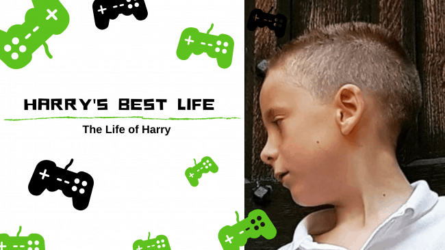
I original font is easy to read, clear and works well when the font is in small or large sizing. Just to see the difference, I changed only the font and you can see the difference the change can make.
This below image is using a free font called Eat your vegetables – Now, while I do like this font I feel it only works when using capital letters, the letters when using lowercase are too squashed together making the works much harder to read.
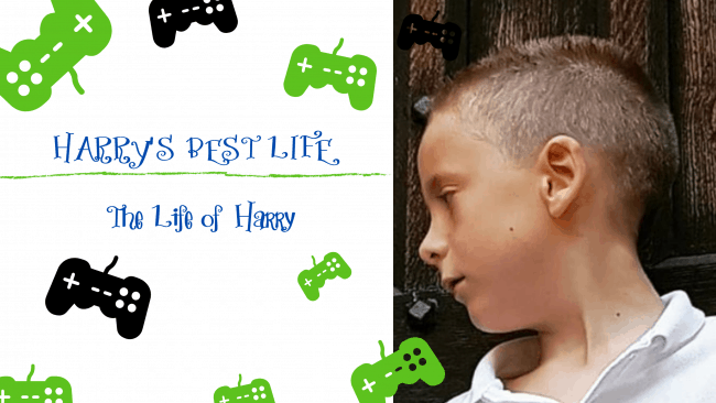
The next is made using a font called Appealing and I really didn’t like this one at all for this design as it has made it very hard to read to do the bubble style writing.
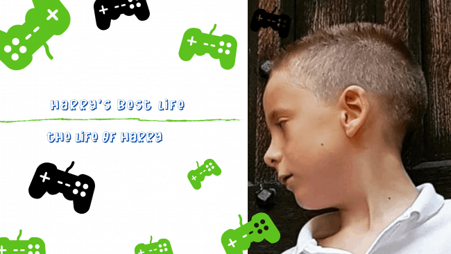
The next I am in two minds about, while I like how the font looks and it is easy to read, I dislike that it has made the letter a in Harry’s name a lowercase a when all the others are capital letters and to me that just looks so wrong! Although, he is 7 and this is how he does sometimes write his name (with a mix of lower and uppercase lettering).
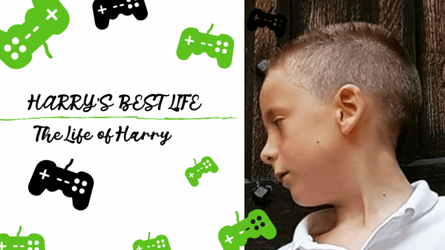
And lastly, another font style – it really does show just how different font styles can change a logo. I’m not that keen on this one either, the smaller writing it much harder to read due to the letters being closer together.
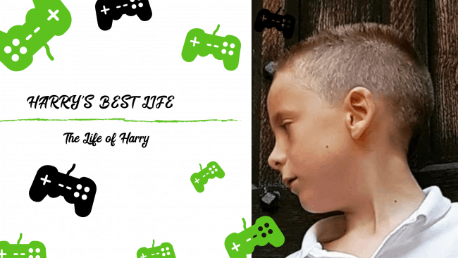
In conclusion, it really is worth spending a little time playing around with different fonts just to make sure your readership can easily read what you have typed otherwise a lot of your message is lost due to the font being illegible.

[AdSense-A]

Related Posts:


Discover more from Emmy's Mummy
Subscribe to get the latest posts sent to your email.
